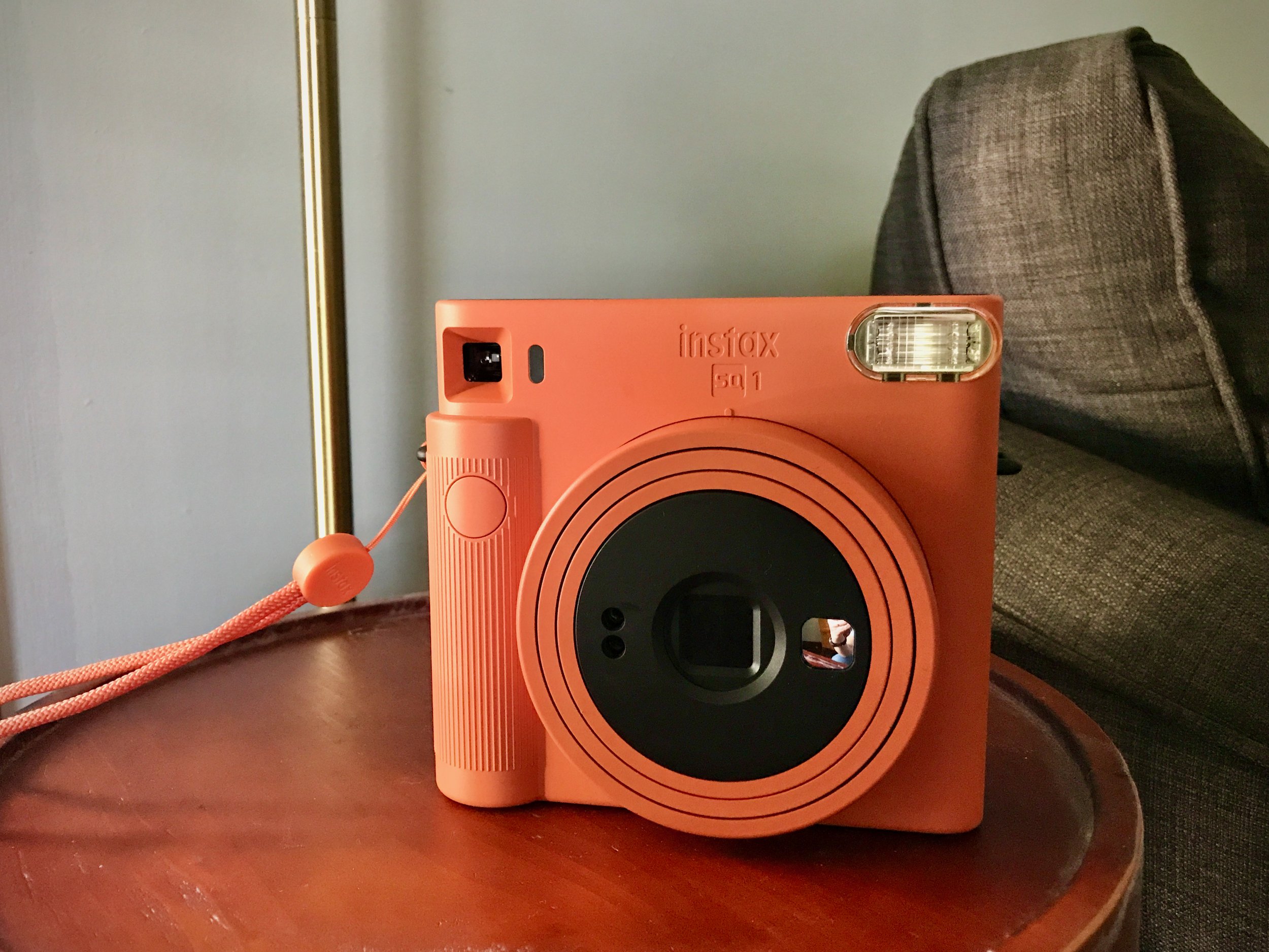
Fuji instax SQ1 | April 27, 2021 | iPhone 7
This is a Fuji instax SQ1 camera. It takes square-format instant film photos (like a Polaroid, albeit a bit smaller), and has zero settings to adjust. You point, you click, the flash fires (it's set to always fire, no matter what), and a photograph will emerge from the top slot.
I figured to start this series off with a photo of the camera itself, because I do think it looks fantastic. In the shots that follow, I'll show a bit of what it can and can't do. As a TL;DR for my take on it—I think it's a beautiful camera, I'm very happy to have it, but its constraints can get a little frustrating if you are, like me, a fiddly photographer by nature or simply want to be able to exercise some control over your image at the point of capture.
But the lesson to be had here is to think carefully and work around the camera's limitations, and as time has gone on, I'd like to think that I've done a better job of that.
Exit/Entrance | May 5, 2021 | instax SQUARE SQ1
Exit/Entrance | May 5, 2021 | Canon 60D, Canon EF 28–90mm
As an experiment, I took some comparison photos last year and added a sort of twist to them. I'd take one shot with the instax SQ1, and then shoot the same subject with my Canon 60D, a digital SLR camera. Then, in Photoshop, I'd lay a square crop of the digital image on top of the scanned border of the instax one.
I was playing with the idea of how the border affects how we perceive photographs. And maybe also with blurring the distinctions between what's film and what's digital.
It was kind of fun, but I ultimately gave up on it because it got pretty time consuming, and I could never get it 100% right from a technical perspective (see, for instance, how image 2 is much more zoomed in than image 1).
I also lost interest because I started to assume that in any head-to-head comparison, a viewer's eye and maybe even their preference would gravitate towards the sharper digital image no matter what. This is perhaps less about analog vs. digital and more about how image quality affects attention and interest—I imagine that if I'd shot image two with my Canon AE-1 Program film camera, I'd feel the same way.
The instax format has its own aesthetic qualities that I think are quite nice, and would probably be best appreciated on their own.
Still, I thought it fun enough to share one of these, and I do think this is a decent example of what the SQ1 can do under partly sunny/partly cloudy conditions. Those conditions, and maybe even slightly overcast, are probably ideal, otherwise I found that lighter tones on subjects risk getting blown out between the 800-speed film, the hard sunlight, and the always-on camera flash.
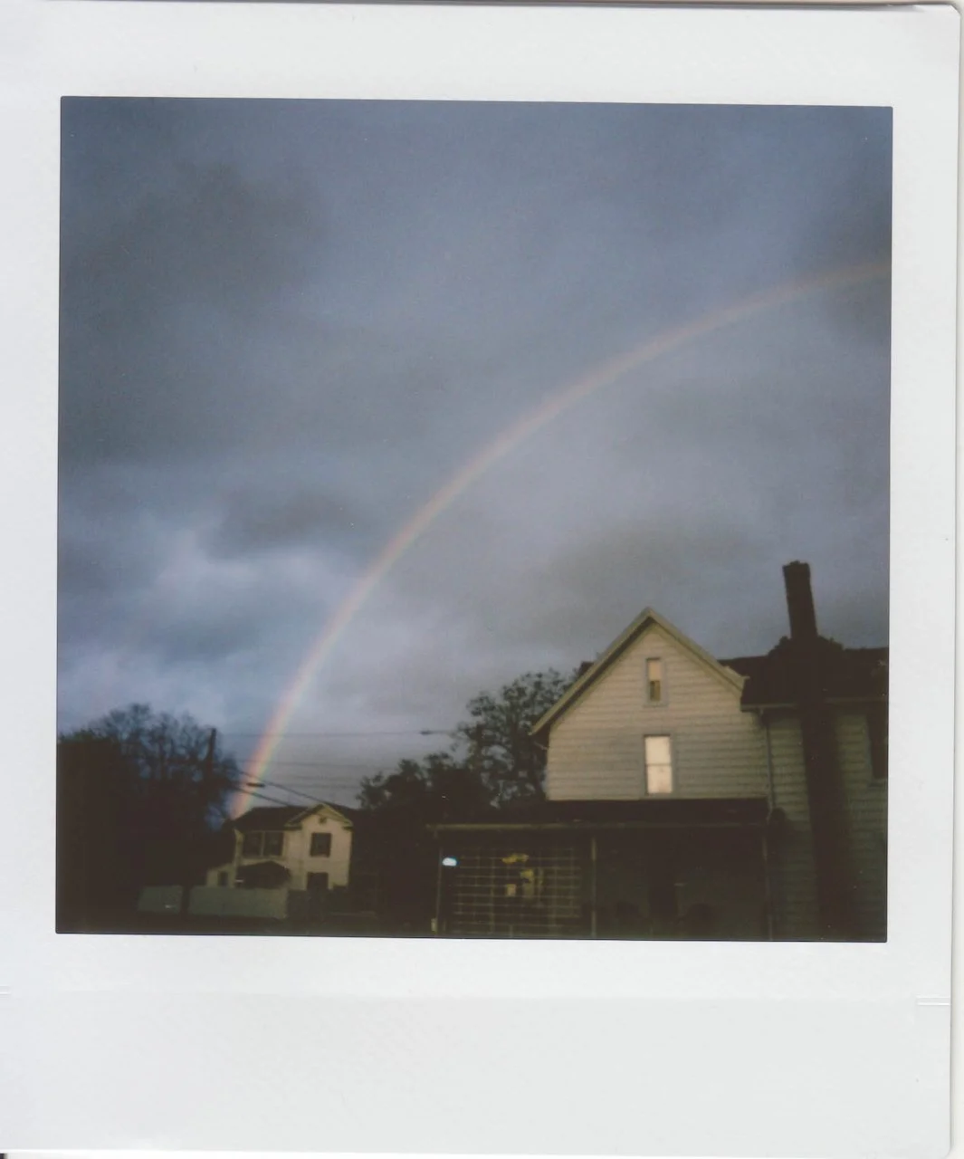
Double Rainbow | May 7, 2021 | instax SQUARE SQ1
I was surprised this one actually came out, but I'm happy that it did. There isn't enough light here, so the shadow areas do come out pretty muddy. I think that if it were completely overcast, this would probably be even worse, but I think there was probably a warm light coming through from the setting sun behind me here. Maybe a gap in the clouds, or they were thin enough that enough came through to help out the upper portions of these houses.
The flash would have fired here, too, but of course it's not powerful enough to illuminate the houses on their own. I'd say it's a good thing there isn't anything close enough for it to hit—it would be way too bright and distracting, and I think the background would have gotten more underexposed too (though I am no expert on flash and how cameras manage flash exposure).
Sunflowers and Balloons | August 14, 2021 | instax SQUARE SQ1
Usually you want to shoot with the sun behind you, with that light illuminating your subject (not always the case, but most of the time). With the SQ1, however, sometimes this approach can work against you.
The camera uses a fairly sensitive, 800-speed film, the flash always fires, and its shutter speed is limited. So, on a sunny day, there's a high chance that shooting with the sun behind you will leave your subject blown out. In the words of Carlos Carreter Oróñez in the Facebook Worldwide Instax Shooters & Printers group, it's "impossible" to get correct exposures on a sunny day under these constraints.
Over time with this camera, I've found myself often looking for situations where my subject is lit from behind or from the side. This way, the area surrounding the subject is pretty brightly lit, and the always-on flash will fill in. So instead of a silhouette, the photograph will show a pretty even exposure throughout much of the frame.
So in this shot, at this time of day, most of the light is coming from behind the sunflowers, and that's what's primarily reflected on the back half of the table. While it is daylight, a good bit of front light on the flowers here is coming from the flash. If I were to have shot with the sun behind me, aside from not having those balloons in the background, there's a good chance the flowers would have come out far too bright.
Cocktails | May 6, 2021 | instax SQUARE SQ1
Cocktails | May 29, 2021 | instax SQUARE SQ1
The SQ1 has a "closeup" mode that's made to change the camera's focus so that it will focus at a range of 30cm–50cm (in the normal mode, anything from 50cm onwards ought to be in focus). This is good for closeups, of course, as well as for selfies.
It's elegantly executed—to go into this mode, all you have to do is twist that same ring around the barrel that you'd use to turn the camera on.
I probably used that mode for one or both of these, though truthfully I didn't take note of it at the time.
One thing to note about photo 2, it's on the instax square format's black and white film. It is more expensive, though, and while I was pretty happy with the results from that pack, I didn't love it enough to want to pay the price premium for them over color film.
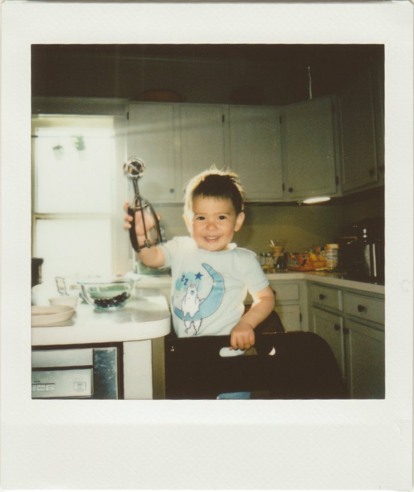
I have a small binder full of instax photos, and most of them are of this dear little guy.
Aside from my desire to share his absolute cuteness, I thought I'd post these because they're a half-decent example of what the SQ1's indoor shots of humans look like under different lighting conditions.
In image one, he's holding up a cookie scooper atop his stool in the kitchen. There's a giant smile on his face, and broad rays of light come through the window behind him. We can see the background clearly, but we can also see his face and smile, courtesy of the always-on flash.
If I'm understanding this right, the camera is exposing for the light in the scene, and given that the flash and sunlight are both pretty bright, so the lighting looks pretty even between foreground and background.
In image two, he's holding a small pumpkin by its stem and smiling at the camera. We can see his face, but the rest of the background is pretty dark. The room this was taken in isn't naturally very bright, but it certainly isn't as dark as this. Here, that darkness is caused by the camera exposing for the subject brightly lit by the flash, but unlike in photo one, that background is starting out a bit darker (darker at least than morning light streaming in through a window). So as the camera tries to expose the subject properly, that background gets darkened.
The look of image two does shout analog/film very loudly, and I can see how this aesthetic might be appealing. In my case, though, I'm mostly keeping an eye out for those backlit and sidelight moments, as I think I'm just going to like those results much better.


